MARLEE MCMAHON (VIC)
Marlee McMahon graduated from the Victorian College of the Arts with a Bachelor of Fine Arts (Honours) in 2017. She has shown in solo and group exhibitions in Victoria, interstate and overseas. Her painting practice explores the intersection between graphic design and abstraction.
Transitional moment
In the mid-90s graphic design entered a pivotal historical moment: the desktop computer had started to make its way into teaching institutions and studios. Designers began exploring digital design—opening early versions of Photoshop and Illustrator, pushing pixels about. With these programs it was possible to create artworks with simple shapes and uncomplicated shading effects. Trust me when I say that these artworks took an awfully long time to produce. Given that almost nothing was networked and the internet was in its infancy, they were even harder to share.
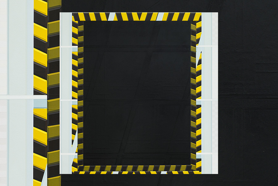
Hovering between geometric abstraction and graphic design, Marlee McMahon’s paintings take their cues from this digitally inflected graphic language of the 90s. In this regard McMahon is interested in style. In the painting Sun Bleached Sodastream, the colour palette and composition—two empty rectangles framed by angular decorative spirals—recall early desktop publishing program Quark Xpress. The artwork’s classical lines reference not simply antiquity per se but the 90s’ taste for antiquity and classicism.
Repetition of pattern and shape is central to McMahon’s pictorial strategy. Pillow Chocolate recreates the dark, subtle tonal variation of the backgrounds of early video games, engaging the viewer in a hypnotic state, a Tetris-like daze. In this work and others, a thin line frames or cuts through the composition, radiating a phosphorous energy. With a colour palette that encompasses primary and tertiary shades, McMahon’s paintings routinely surprise and delight, oscillating between sparseness and complexity.
Pop artists—as well as photographers such as Ed Rusha—have drawn attention to the negative space in graphic design to comment on consumer culture. McMahon commands graphic elements in her paintings with a similar feeling for space. In Cavity, Clearasil, KitKat For One, and Designer Sale (M-tooth), the artist extracts the signposts of consumerism—the houndstooth of a David Jones bag, decorative graphic embellishments of packaging—and utilises them as visual motifs or refrains.
McMahon’s abstract paintings border on the architectural. Rendered in precise brushwork, the artist’s complex formal arrangements embody a process of construction or, as the case may be, a kind of imaginative reconstruction. Their quiet, controlled intensity—an effect borne of the hour upon hour of toil required to produce such a calm surface—captures the durational quality inherent in work from a relatively recent past, now so long ago.
Essay by Anna Zagala.
Anna Zagala is an arts writer in Tarntanya/Adelaide, South Australia.

